Polygraph
“What Could Bowling Green Be“ report
An interactive report visualizing community input on the future of Bowling Green, KY.
The Minnesota Star Tribune
Down the Mississippi River, an altered wetland landscape faces new threats
An interactive tour through the Mississippi River Basin, from bog to bayou, that explores the changing wetland landscape.
The Pudding
Music DNA Legacies
The generational legacy of samples in music
Axios
How a ransomware attack works
One of the most devastating types of cyberattack companies face today has been around for decades — and its perpetrators have hardly had to innovate to stay profitable.

Polygraph/Google Trends
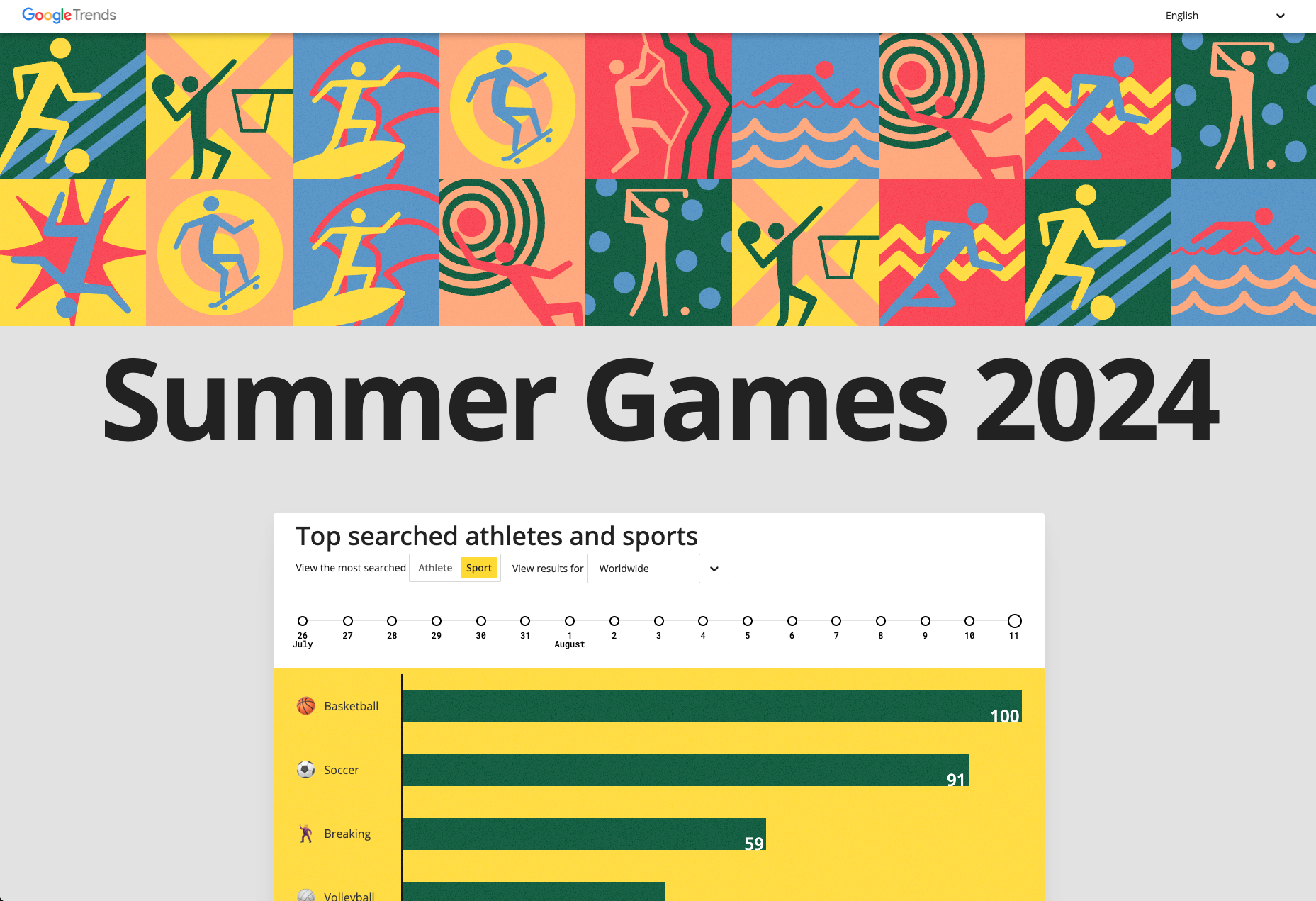
Google Trends at the 2024 Summer Olympics
Daily-updating Google Search data about the 2024 Olympic and paralympic Games in Paris.
Axios
Extreme heat threatens future Summer Olympics
Athletes are raising concerns about scorching temperatures at the 2024 Paris Olympics, which could affect not only athletes and attendees' health but also athletic performance.
Polygraph/The Aspen Institute
Weave Trust Map
A multimedia visual storytelling experience visualizing the Social Trust Index at the neighborhood level
Axios
The domino effect of the Israel-Hamas war in Gaza
The Israel-Hamas war has triggered new cycles of violence beyond the borders of Gaza, drawing global attention to the network of Iranian-backed militias that wield influence — and arms — across the Middle East.
Axios
Is 2024 the Cicadapocalypse or a Cicadapalooza?
In 2024, a double brood of periodical cicadas will appear across the United States. Some have called the emergence a "cicadapocalypse," but is it really?
Axios
The bitcoin ETF saga
How bitcoin believers conceived the cryptocurrency to make it as easy as possible for traditional investors to buy in — and how Bitcoiners refused to give up when regulators pushed back.
SND Bronze medal
Axios
How Canada's wildfires devastated U.S. air quality
For months, smoke from Canadian wildfires blanketed the U.S., causing the worst air quality on record. Is this the new normal?
Polygraph/Google Trends
Google Trends Time Capsule
Explore the history of Google Searches
Axios
Rising sea levels threaten hazardous waste facilities along U.S. coast
Sea level rise due to climate change is threatening hazardous waste management infrastructure along U.S. coastlines

Axios
Rock & Roll Hall of Fame: Why women wait longer than men to be nominees?
On average, women wait twice as long to be nominated for the Rock and Roll Hall of Fame, according to an Axios analysis.

Axios
Box office dominance of action and adventure movies
Visualizing the box office dominance of action and adventure movies
Award Winner

Axios
Can you trust your eyes?
How to spot deepfakes created by AI image generators

Axios
Data Wizard
A tool for reporters to pull data from for a wide range of topics including stocks, crypto, mortgage rates, Census figures, and weather, and then export to the newsroom chart tool.
Axios
Communicating in color
How the women of the British monarchy use their clothing to send a message

Axios
Analyzing “thank yous” at the Oscars
Visualizing the most commonly used words in Academy Award acceptance speeches from 1939–2022
Axios
Graphic request logger
A Slack/Bolt.js app for logging graphic requests to Google Sheets and fetching data summaries
IIBA Shortlist
Axios
History of pickup trucks
Pickup trucks have gotten bigger, higher-tech — and more dangerous
Award Winner

Axios
Draw your neighborhood
Interactive game to draw neighborhood boundaries and compare answers to other Axios Local readers.

Axios
1 million deaths
Remembering the lives lost to COVID-19 in America.
Personal project
The mewithoutYou “Farewell” Tour, visualized
Visualizing the setlists of the band's final tour

Personal project
concert.log
An incomplete list of shows I've been to; omissions by error or embarrassment

Axios
Zoom shuffle bot
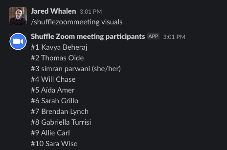
A Node.js app to get the participants of a Zoom meeting and return a shuffled numbered list via a Slack slash command
Axios
The year in Covid
From the winter surge to the arrival of the vaccines — and then, sadly, back to the start of a new winter surge.

Axios
Employee departures by industry sector
Food and hospitality industries still recovering from pandemic shock

Axios
Batch chart generator
A process for programmatically creating charts and maps using the Datawrapper API in bulk
Award Winner

Delaware Online
Delaware gun violence database
In 2017, Delaware Online/The News Journal began to log every shooting that is reported in the state, as there was and continues to be no public database of these acts of violence
Award Winner
Delaware Online
Better loving through chemistry
Old letters capture epic China-to-Delaware immigration story
Award Winner
Delaware Online
Racial Vaccine Gap
Wealth and race still affect vaccine rates in Delaware, and it's getting worse
Award Winner

Delaware Online
Letters to the past
What would you tell yourself before everything changed?

Personal project
Critical Words
A brief text analysis of the popular D&D live play web series
Award Winner
Delaware Online
18 Hours in C Building
A visual walkthrough of how the Vaughn riot unfolded
Delaware Online
What does Delaware's urban growth look like from above?
Looking back at twenty years of development using satellite imagery

Towards Data Science
Yes, Rep. Borowicz invocation was unusual
An analyses of more than 400 invocations since 2013 shows why the prayer stood out

Towards Data Science
Visualizing the 2017 wildfire season
2017 was a devastating year for wildfires in the United States, especially in California that had more than 9,000 fires burning over 1.3 million acres
The Philadelphia Inquirer
Who’s running for Philadelphia City Council?
How the more than 50 Council candidates divided up in 2019
The Philadelphia Inquirer
Pennsylvania, Polarized
How a blue wave and red response deepened the state’s political divisions

The Philadelphia Inquirer
The emergency landing of Southwest Flight 1380
Mapping the mid-air explosion and emergency landing of Southwest Flight 1380