New website! Some takeaways from building
Published May 11, 2022
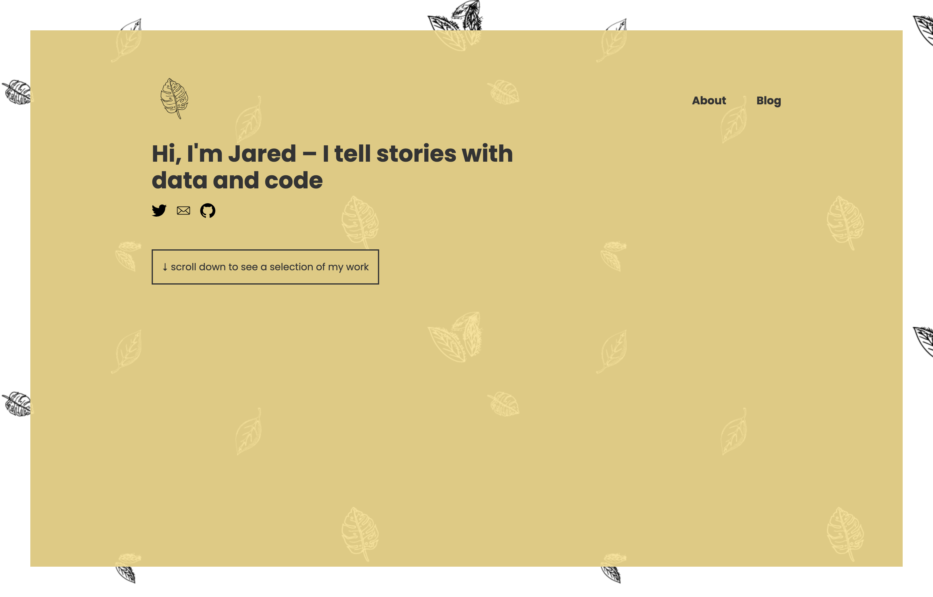
If you’re reading this, it means I successfully deployed my new personal website. Huzzah! Over the years, this site has gone through multiple iterations and styles, especially as I transitioned from multimedia storytelling to data visualization and design. This latest attempt has a heavier design focus and is the first to incorporate any type of page routing.
I typically only dust off this domain when I want to try something new. This time around, it was SvelteKit, a framework for building Svelte web applications. I started building with Svelte late in 2021 when I joined the team at Axios, and I fell in love with its simplicity and design philosophy. So obviously a framework built around multipage Svelte apps was a natural choice.
Here are a few ideas I wanted to explore with this redesign and things I learned along the way.
Parallax scrolling + background filters
Neither of these features are groundbreaking territory and I’ve used both in projects multiple times, but I had the idea of leaves falling as you scroll and having the leaf colors invert as they intersected web elements. It was also the first time doing either of these techniques in Svelte so it seemed like a fun challenge.
The parallax part was remarkably easy. I made two separate images with leaves scattered about on a transparent background. Both are assigned to the background-position property of the hero container. Then using the scroll position, I manipulate the background-position at different rates.
Svelte makes this incredibly easy since you can listen for the scroll position using <svelte:window> and immediately pass that to a component.
<script>

let position;

$: {
  position = {
    x1: `${d / 300}%`,
    y1: `${d / 20}%`,
    x2: `${d / -200}%`,
    y2:`${d / 50}%`
  }
}

</script>

<svelte:window bind:scrollY={d} />

<Wrapper
  classes="parallax vh color"
  backgroundColor="rgb(246, 224, 148)"
  position={`${position.x1} ${position.y1}, ${position.x2} ${position.y2}`}>
  <Hero />
</Wrapper>
As for the color inversion, backdrop-filter: invert(1) (sorry Firefox) with a reduced opacity on the background color delivers the desired effect.

Markdown blog
I’m not great at documenting my work. Too many years as the lone coder in a newsroom instilled bad habits and I relied way too much on mental recall when revisiting old projects. But I’m older and wiser now, and do try to take the time to write up a passible README before publishing a project. And as part of that, I wanted to make publishing project breakdowns and posts about interesting things I learn a part of this redesign.
As for the how, I don’t have much to say that isn’t already covered in this fantastic tutorial by Josh Collinsworth. In addition to teaching me how to build this site with SvelteKit in general, it showed me how to use mdsvex to preprocess Markdown files and turn them into Svelte friendly html.
Publishing
The last few versions of this website and most of my personal projects live as static Github Pages. This time I wanted to try Vercel, a platform for frontend frameworks and static sites. My motivation for this was simply that I wanted an easier update method for a blog I would (hopefully) be posting to with some frequency,
I was amazed at how simple the process was. Create an account, point it towards a Github repo, hit deploy and bam – live website.
That’s it!
Thanks for reading and I hope you like what you see. Check out a selection of my work on the homepage. If you have any questions (or to report something broke…), you can reach me at jared.m.whalen@gmail.com.